If you’ve been working from home for awhile now then you’ve probably grown tired of staring at the same four walls. Adding a splash of colour to a room can be a great way to make a statement and lift your mood. Whether you’re using colour for the first time or looking for inspiration for a new project, here we explore five ways to dial up the brightness in your home.
CHOOSING YOUR COLOURS
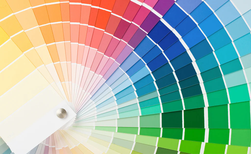
Colours can make us feel a range of different emotions: from happy to sad, calm to excited. These reactions have their foundations in psychology, biology and cultural imprinting. Common colour associations include:
- Red: passion, love, danger, strength
- Pink: romance, feminine, sensitivity, exciting
- Purple: sensuality, royalty, spirituality, mystery
- Yellow: optimism, sunshine, confidence, positivity
- Green: health, growth, peace, vitality
- Blue: calm, trust, serenity, peace
- Orange: energy, positivity, warmth, creativity
- Brown: honest, natural, simple
- Black: elegance, power, luxury
- White: pure, simple, fresh, clean
The way colours can affect our emotions can depend on brightness, shade, tint and whether they are warm or cool-toned. Introducing your favourite colour is one of the simplest ways to add personality and intrigue in a room. The key thing to remember when introducing it is to find the right whites or greys for your baseline. White has the amazing ability to make any room feel bigger, but try using shades with a blue, green or pink undertone, rather than a black undertone, to enhance your colour accents.
USING COLOUR WITH THE 60-30-10 RULE
Trying something new and putting that first stroke of paint down can seem like a scary prospect. If this is you, then the 60-30-10 rule can help you to feel a little more in control.
- 60% is the main colour for your room and acts as a backdrop for everything else. This would be the majority of your walls, carpet, a large rug, or your sofa.
- 30% is your secondary colour. Use half as much as your main colour and choose this for curtains, accent chairs, bed linen, painted furniture or a feature wall/ceiling.
- 10% is your accent colour. This might be your cushions, accessories, lamps or artwork. It may even be picked out from printed fabric on larger items.
Bear these in mind as you think through the following ideas...
#1 GO BOLD WITH YOUR WOOD OR METALWORK
Opting for coloured skirting boards, sills, picture rails, doors or frames can help to lift an otherwise plain room. If you’re feeling particularly daring, try using neon shades such as Rust-Oleum’s ultra bright neon pink. Be sure to prepare your surfaces before painting by lightly sanding and/or using a primer as required.
#2 TAKE YOUR CEILING UP A NOTCH
If feature walls aren’t for you, consider adding colour to your ceiling instead. A soft, pastel shade can help to change the mood without being oppressive. A soft pink can work wonders against white walls with a pink undertone, or, for a more dramatic look, try contrasting colours such as grey walls and woodwork with a yellow ceiling.
#3 EXPERIMENT WITH WALL ART
If you live in a rental property, many landlords won’t allow you to change the paintwork, but you can add a touch of colour by playing with bold statement pieces. Wall art such as canvases and tapestries can add texture and colour to an otherwise stark wall while mounting bright ceramics and other trinkets can help to bring some of your own personality to the space.
#4 DARE TO ACCESSORISE
Accented cushions, contrasting throws or coloured lamp-shades can help to add light and interest to an otherwise dull area. Also, as with wall art, using accessories means you can change the look at any time without having to redecorate. Don’t forget to add plants into the mix, whether real or artificial, to keep your room feeling fresh and vibrant.
#5 MAKE YOUR FURNITURE STAND OUT
Upcycling is an effective way to experiment with styles and colours without breaking the bank. Pre-loved chairs, tables, shelves and more can be easily picked up from charity shops, eBay, Facebook Marketplace and local freecycling sites. Go bold and paint the whole piece or find a shade that complements the original wood or metal tones.
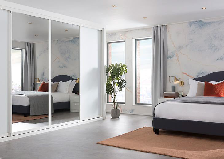
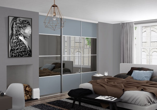
Of course, at DoorsDirect we know what a difference colour can make to a home. That’s why we offer a huge range of shades and finishes for our sliding wardrobe doors, many of which you can view online on our samples page. If you have a particular colour in mind that you can’t find on our website, please do give us a call on 01423 50 20 40 as we’d love to help you.
